Paving the future: Product Strategy and Design System for NOZ​

Development of NOZ’s Product Strategy and Design System to align teams around a clear product vision, enhance consistency, and create a scalable, accessible, and customizable design foundation that accelerated product delivery and improved collaboration across the company.

Product Strategy
B2B SaaS
Community Manager
Design System
User Experience (UX)
User Interface (UI)
Design Thinking
Cross-functional Team

Team:
Product Designer Lead, Senior Product Designers, Product Manager, Head of Design

Connecting brands with its audiences

Founded in 2017, NOZ is a community management platform focused on bringing brands closer to their audiences through communication, training and gamification.

Community
A connected group of individuals who share common interests, values, and goals, nurtured through meaningful interactions.

Engagement
Active participation and emotional investment of users in a brand’s activities on the platform.

Trainings
NOZ offered internal trainings with certifications and quizzes to support continuous learning.

Rewards
Tangible or intangible benefits that recognize and incentivize user participation and loyalty.

Problem

Lack of product vision alignment and inconsistencies across the platform due to the absence of standardization

Goal

Define a clear product strategy and establish a scalable, consistent, and accessible design system.

Solution

Conducted research, competitor analysis, and workshops to shape the product vision, and built the NOZ Design System to unify components, improve usability, and accelerate product development.

Product Strategy

We aligned business goals and user needs through research, workshops, and competitive analysis to define a clear and scalable product vision.

User Research

To guide the product strategy, we conducted both qualitative and quantitative research. The combination of both approaches provided strategic insights and helped shape a product vision aligned with real user needs.

  • Navigation and Usability Issues
  • Demand for Consistency and Customization
  • Key Features Prioritization

Qualitative Research

Format: 30 in-depth interviews
Focal Group: Customers
Goal: Understand perceptions, pain points, and expectations

Quantitative Research

Format: Online survey
Focal Group: Platform users
Goal: Identify patterns, usage habits, and prioritization needs

Competitor Analysis

We mapped and compared feature availability across key competitors, with a focus on communication tools, gamification elements, training modules, and chat capabilities. This analysis helped us identify market gaps and define strategic priorities for NOZ’s feature roadmap.

Co-creation Workshops

I facilitated collaborative sessions with cross-functional teams and key stakeholders to align perspectives and uncover strategic opportunities. Using tools like SWOT Analysis, we identified internal strengths and weaknesses, as well as external opportunities and threats.

Product Vision

Based on findings, we defined a clear and actionable product vision: to deliver a unified, customizable platform that empowers community managers with efficient tools for communication, training, and engagement. This vision guided design decisions, prioritized features, and set the foundation for scalability and consistency across the product.

Design System Development

Based on the product strategy, we identified inconsistency and scalability as key challenges. Creating a design system was our first step to ensure visual and functional coherence across the platform.

Component Audit & Mapping

We started by auditing the existing interface components across the platform. By mapping UI patterns and inconsistencies, we identified redundancies, usability issues, and visual misalignments, a crucial step to define the foundation of the new Design System.

Design System Principles

The Design System is guided by clear principles that ensure every component supports a consistent, inclusive, and adaptable experience. These pillars served as the foundation for all design and implementation decisions.

Consistency

Establish unified patterns to create a cohesive visual and functional experience across the entire platform.

Accessibility

Prioritize inclusive design by ensuring components are usable by all people, regardless of ability or context.

Customization

Flexible components that can adapt to different needs, branding layers, and usage scenarios without compromising consistency.

Design Tokens

We defined the foundational design tokens, including color palette, typography and spacing to ensure visual consistency and make design decisions scalable. These tokens serve as the single source of truth for both designers and developers.

Component Library Development

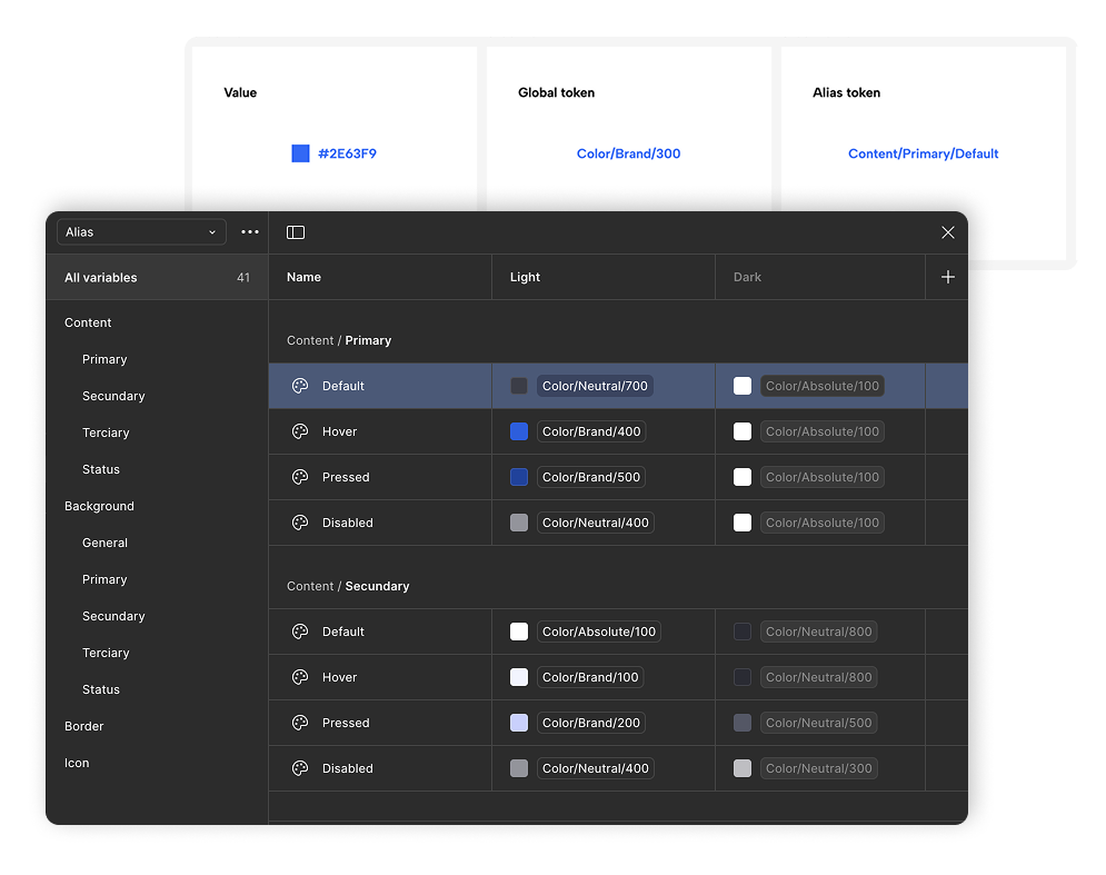
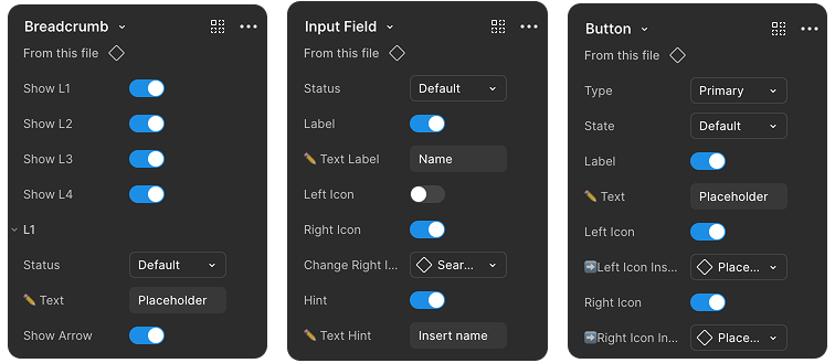
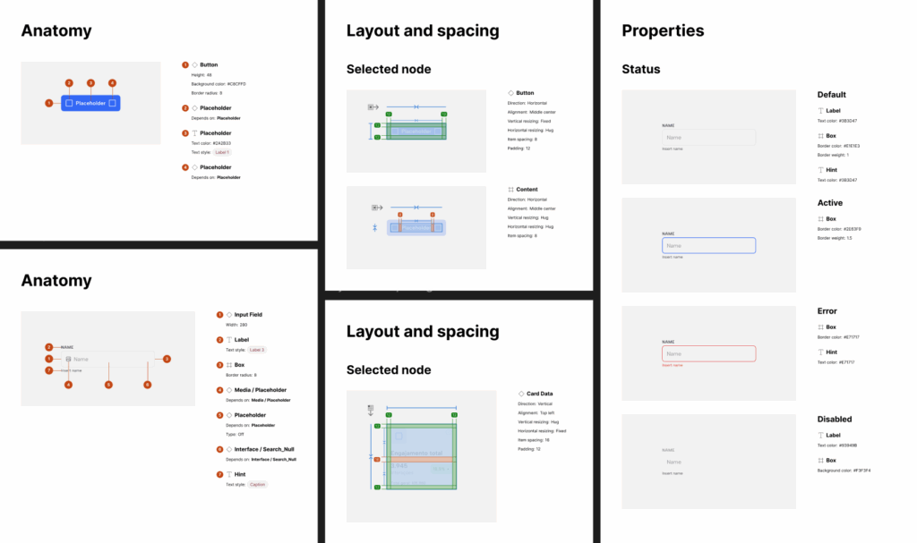
With the design foundations established, we built and documented the core UI components used across the platform.

All components were designed with multiple states and variants, and optimized for responsiveness and Dark Mode compatibility.

  • Buttons (primary, secondary, terciary, icon)

  • Form elements (inputs, textareas, checkboxes, radio buttons)

  • Feedback (alerts, toasts, badges)

  • Navigation (tabs, sidebars, dropdowns)

  • Layout elements (cards, modals, accordions, tables)

  • Utility components (tooltips, tags, spinners)

Components Properties

To enhance usability and scalability in Figma, we structured components using native properties like variants, boolean toggles, text overrides, and instance swaps. This approach simplified customization, reduced duplication, and empowered designers to work faster and more consistently within the system.

Accessibility

Accessibility was a core principle throughout the Design System development. We followed best practices and guidelines to ensure that every component could be used effectively by all users, regardless of ability or context.

WCAG Color Contrast

We validated all color combinations to meet WCAG AA and AAA contrast requirements, ensuring legibility in both Light and Dark modes.

Keyboard Navigation

Interactive components were structured to support full keyboard navigation, allowing users to navigate, focus, and interact without a mouse.

Alt Text Description

We defined clear alt text guidelines for all icons and imagery to improve screen reader support and overall accessibility compliance.

Light and Dark Mode

We designed the system to fully support both Light and Dark Mode, using semantic tokens to manage color roles consistently across themes. 

Handoff Documentation

Detailed and structured documentation to ensure a smooth handoff between design and development. Each component includes usage guidelines, anatomy, states, and layout and spacing — enabling developers to implement with accuracy and reducing rework or misalignment across teams.

Screens Showcase

This section presents real examples of the Design System in action. The screens demonstrate how components come together across different use cases within the platform.

Results and Impact

3x

faster prototyping process

+48

standardized components created

+128

components variants created

Learnings from the Project

Throughout this project, I have gained valuable insights into how to align product strategy with design operations, improve collaboration, and scale systems efficiently. Here are some key takeaways:

  • The success of a Design System depends as much on adoption and education as it does on visual consistency.

  • Clear documentation is a living asset that empowers teams and reduces dependency on design leads.

  • Product strategy work brings clarity and prioritization to design decisions, especially when time and resources are limited.

  • Feedback loops between designers and developers are essential for a sustainable system.